Data-driven, content-first design

I’m working on an app for the DonorChoose.org Hacking Education Contest. DonorsChoose works by having teachers submit classroom project/supply needs that people can then donate to pay for through the internet. Right now the only way to “share” those projects is through the usual email, Facebook and Twitter; my idea for am app is to create custom printable 4-up (quartersheet) flyers for handing out, and pull-tab sheets for posting-up. Despite the “power of teh internets”, I think consideration of local resources and capacity is an important value to recognize—and helping teachers and allies advertise their needs (and the positive outcomes they hope to create) more easily within their physical communities would go far towards advancing DonorsChoose.org’s mission.
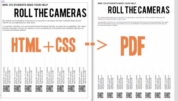
This project has the typical technical difficulties: my goal is to use the DonorsChoose API to fetch a particular project and then populate an HTML+CSS preview—allowing the teacher to then live-edit the text (both for layout and because writing for a local audience is different than an internet one)—and then use dompdf to convert that HTML+CSS to a printable PDF. The dompdf library is nifty: it supports CSS 2d transformations, custom fonts, images (necessary for QR code hotness), light positioning (no floats, so tables it is), and media-queries (@media screen and @media print) to fix all the little layout and typography issues in translating from the web to print, as well as dompdf’s own myriad quirks. Basically it’s everything I need to make a not-too-ugly flyer and pull-tab sheet; the image at the top of this post is the ugly proof-of-concept.
But the biggest challenge is designing a layout scheme that is flexible to the wide range of DonorsChoose project content. Designing for an 8.5 x 11” sheet of paper is way different than designing for the web: creating a balanced—or at least aesthetically-acceptable—design is no easy matter when there is no such thing as overflow. I hope to get around some issues by providing a live-preview so that teachers can fix any egregious text over-/under- runs, but the goal is to get teachers to Click-Print-Post as quickly as possible.
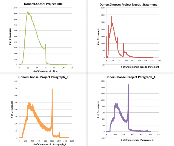
Fortunately I have a designer (the awesome Billy Brown) helping with the layout, but I need to give him some idea of what to expect. Fortunately DonorsChoose made available project data for ~296,000 projects. So I parsed through the lengths for the 4 main pieces of content I want to use in order to get the distribution of lengths. Sure, saying “Design for a title that is 10-50 characters” doesn’t have the highest specificity, but it’s a whole lot more useful than the alternative of blind experimentation. The data below is charts of those lengths—I probably will have to limit my data to just the past year or so since DonorsChoose has changed their requirements/text-fields over time, but its interesting so far to see the full distributions.
