Fondly remembered experiments in minimal webdesign
 Tomorrow is launch day for a blog aggregator website I worked on, but because I can’t write about that just yet I thought I’d write about a website whose development has influenced a lot of my approach to minimal webdesign: Pantextual.com
(Few things ever die on the Internet, but Pantextual is definitely past its prime and has aged poorly as functions have been disabled to thwart spammers. Be that may…)
Pantextual was a micro-blogging experiment developed by Rebecca White and me in 2006; before we were completely sure we wanted to blog via text message. As an experiment, our intent was more of exploration than refinement—and refining with Drupal 5RC would have taken all the fun out of it. Our about page read:
Sometimes even a little bit is too much.
But what if it was really beautiful, interesting and fun?
Then you might not notice all the other irritations of life so much.
Perhaps you might enjoy it.
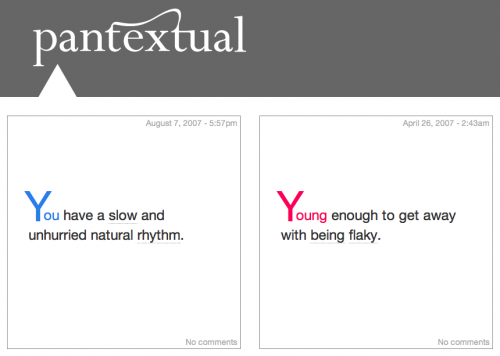
Our goal was to fit as much content into a square box as possible and yet still make it a pleasure to read and an invitation to explore.
There was the obvious: nice typography (and Rebecca is to thank for the lovely ligature in the logo); gracefully overflowing if the content wouldn’t fit (you never know); not overwhelming the reader with content, even if it’s brief; and being playful: short content tends to be pithy content and we wanted a functional design to match.
The biggest problem by far was metadata. We wanted to stick with the standard conventions: date, author, categories, comments; we needed to find a place to put them and where we put them would determine if they were meaningful. Categories were the most fun to explore.
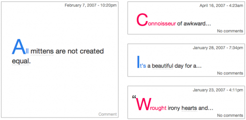
On Pantexual, we put categories inline, creating a custom syntax for tagging words as categories within the content itself. We also only displayed those words as categories if there was more than 1 post with that category. As the website filled in, we would place other content related through the categories next to the post itself, inviting exploration.
All in all, we did pretty good with a 400 pixel square box… maybe we should resuscitate it.

