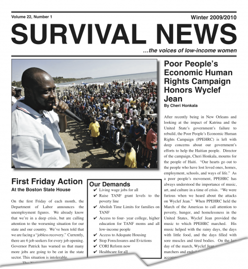
Laying out latest layout

Since November I have been working on print layout for the Winter 2009/2010 edition of Survival News. “The voices of low-income women”, Survival News is half-yearly-ish compendium of news, personal stories, and advocacy information. Nearly half of this edition is devoted to Survival Tips, a collection of services and advice from legal aid to food programs in 3 languages (English, Spanish and Vietnamese).
At 40 tabloid-sized pages, this edition is 52 square feet of pictures and copy. Survival News has a circulation of 4,000, so altogether that’s enough newsprint to cover 1/3 of Boston’s tallest skyscraper, the John Hancock Building: papering it to the 20th floor. Not bad.
I don’t often find myself in InDesign, the layout program I used, but I still had fun with the project. Due to time and process constraints I couldn’t be as free with the design as I would have liked, but I am proud of the outcome. In keeping with the existing style and editorial demands, my goal was to normalize the ideas and voices within the text. I am sympathetic to criticism of this approach. From David Barringer in his essay “Left Wanting”, writing on the conservative design of liberal magazines:
Timid political art. Stale design. The money excuse. The market dynamic in which political speech is toned down for a presumably thin-skinned public. Artistic cowardice masquerading as commercial sensibility. These are the charges, but what is the role of design in political magazines? Is it to perpetuate a stylistic template? To signify stability?
…
“Design is order, economy, teaching people beauty, creating individuals,” says [Mirko] Ilic [designer for the Village Voice]. “Good design is subversive. And because it’s subversive, good design is left wing.”
If I do the next edition, I hope to be able to spend more time on good design.