Numerical Indifference

I was really proud of myself last week when I made what I felt was a valid and illuminating numerical comparison: I wrote that the amount of Broadband Stimulus money requested for projects within the state of Alaska—projects serving rural and underserved communities—was on a per-capita basis about equal to the federal poverty level for a 2-person household. For those of us who work on access and inclusion (and even those that don’t), that’s a much more meaningful statement than writing “about $15,000”.

I have a degree in math, but at the post-calculus level numbers serve little specialized purpose other than to check your work. One of the professors I now work beside, Marilyn Frankenstein, teaches how to make numbers relevant and meaningful by contextualizing them. She does her studies integrating mathematics and numerical literacy into social justice work (I do work within the College of Public and Community Service, after all), which all falls under Radical Math (which is a funny name if you find math funny).

That all being said, you shouldn’t provide a number without a reason. And since you’re providing the number for a reason, that reason should be apparent. If you expect someone to think “That’s a really big number” you should tell them it’s a really big number and help them understand just how big it is. A number without meaning is just data, and data is boring. If you’re giving someone data and expecting it to have meaning you’re making someone else do extra work by analyzing that data and coming to the conclusion you already have: the reason you thought the number was important in the first place.

The problem with numbers is that within the sphere of other numbers, there isn’t any reference points (other than perhaps zero). And there are a lot of numbers. More than you can count (hah!).

The problem with people is that we can only remember 3 or 4 things at a time. This means that we tend to bunch the infinite space of numbers into a very small number of groups: nothing, a little, a bunch, and a whole heck of a lot. The way we group things is not by some property of the number itself, but rather by the context it’s given in. By contextualizing numbers and giving them meaning, you move them from data (boring!) to useable information: it is not the numbers themselves that will stick with us, but the meaning they represent.

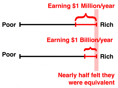
To show this, I made up 2 different surveys and sent them to my friends on Facebook and whoever happens to follow me on Twitter. In the first survey I asked people to place someone who makes $1 Million/year and someone who makes $1 Billion/year on a 10 point scale of Poor to Rich. Nearly all responses placed $1 Million/year between 7 and 10; and placed $1 Billion/year between 8 and 10; both very Rich. Nearly half of the responses placed both incomes as equivalent at a 10: the mostest richest.

I admit that many of my friends are Americorps alums, nonprofitty folks and other liberal ilk, but the point I want to make is that there isn’t a whole lot of difference, within the context of rich and poor, between someone who makes $1 Million/year and someone who makes $1 Billion/year. Myself, I split incomes into about 5 different levels:

  • less than $12k/year: been there, done that

  • $12k - $30k/year: limited fun

  • $30k - $50k/year: the expected earnings potential for my career trajectory

  • $50k-$100k: The job of my dreams and/or did I just go corporate?

  • $100k+: Cloud 9

Now I didn’t ask people specifically about themselves, but there are a few things to notice using myself as an example. There are only a few levels (I condensed 100,000 whole numbers into just 4 groups, plus a 5th group for everything else) and there are more groups for smaller numbers than there are for larger numbers (it’s logarithmic-ish: the group sizes are 12, 18, 20, 50, infinity). Also, the numbers are in relation to what I know: what I’m making right now is in the middle and there are 2 groups above and 2 groups below.

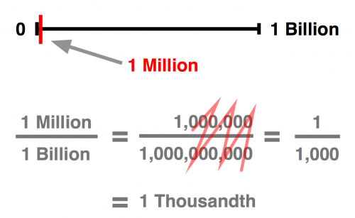
So on to the 2nd survey: I asked people where the number 1 Million would fall on a number line between 0 and 1 Billion. This is actually a pretty  typical “aha!” classroom example and a good number of people got it right (many of my friends are also nerds). What’s interesting is the 25% percent of people (1 out of 4) who got it wrong; they chose 3, 5 or 7: exactly where you would divide a 10 point scale into quarters or maybe a few did it by thirds. That’s the expected thing to do if you don’t know this particular trick (and is also a good strategy in Trivial Pursuit).

So what’s the answer? On a 10 point scale, the answer is actually zero, but since that wasn’t an option in my survey, the most correct answer was 1.

The number 1 Billion is 1,000 times larger than the number 1 Million: and 1,000 still is a big number (hilariously, large numbers are made up of many zeros). Compared to 1 Billion, the number 1 Million is rather pale and insignificant….

…unless you’re talking about something meaningful like someone’s salary. In which case, they’re very much the same.

And if you place them in terms of money that’s been wasted through fraud, for example, then the differences should be made apparent because as I’ve shown adding a bunch of zeros just won’t do it on their own.

When numbers are placed in context to things we know and have experience with, they take on actual meaning. This is from the Pew Research Center’s Excellence in Journalism Project’s Principles of Journalism:

  1. IT MUST STRIVE TO MAKE THE SIGNIFICANT INTERESTING AND RELEVANT

Journalism is storytelling with a purpose. It should do more than gather an audience or catalogue the important. For its own survival, it must balance what readers know they want with what they cannot anticipate but need. In short, it must strive to make the significant interesting and relevant. The effectiveness of a piece of journalism is measured both by how much a work engages its audience and enlightens it. This means journalists must continually ask what information has most value to citizens and in what form. While journalism should reach beyond such topics as government and public safety, a journalism overwhelmed by trivia and false significance ultimately engenders a trivial society.

I’m not saying we all should strive to be journalists, but I think we should strive to make the significant interesting and relevant. To be fair, false significance can be a powerful rhetorical device when it comes to numbers: just watch your evening news the next time they breathlessly “break” a story about public employees making “gasp!” $60k/year. “How dare they make twice the local average income level?!” …because that’s how averages work.

Another example: in my last post about doing the layout for Survival News (“the voices of low income women”), I noted that if the newspapers in circulation were spread out, they would completely cover the John Hancock Building in Boston up to its 20th floor. That’s much more fun and meaningful than only writing “4,000 copies” (the building has already been covered with plywood, so why not?).

And now to the entire reason I wrote this post: I would like to point out that at 40 tabloid-sized pages, the latest edition of Survival News has 52 square feet of copy and graphics: that’s about the same surface area as your refrigerator.


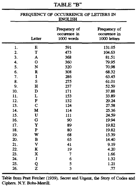
Frequency of occurrence of letters in English

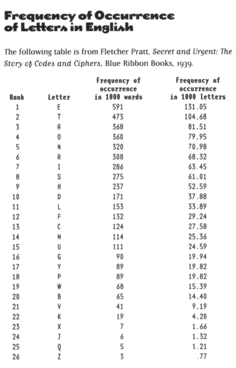
I’ve already posted the cake recipe from PopCo—a great novel by Alice Butler—so here another part of the back matter: a table of the frequency of occurrence of letters in English from Fletcher Pratt’s S_ecret and Urgent: the story of codes and ciphers_, Blue Ribbon Books, 1939. To be fair, the table above is actually from the only place I could find it on the internet: a 1997 patent for a chordic keyboard who cites “Pratt Fetcher”. Fletcher Pratt also established a dining club upon which Asimov’s Black Widowers series was based. Update: Apparently the numbers above are different than what was published in PopCo:


Laying out latest layout

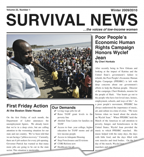
Since November I have been working on print layout for the Winter 2009/2010 edition of Survival News. “The voices of low-income women”, Survival News is half-yearly-ish compendium of news, personal stories, and advocacy information. Nearly half of this edition is devoted to Survival Tips, a collection of services and advice from legal aid to food programs in 3 languages (English, Spanish and Vietnamese).

At 40 tabloid-sized pages, this edition is 52 square feet of pictures and copy. Survival News has a circulation of 4,000, so altogether that’s enough newsprint to cover 1/3 of Boston’s tallest skyscraper, the John Hancock Building: papering it to the 20th floor. Not bad.

I don’t often find myself in InDesign, the layout program I used, but I still had fun with the project. Due to time and process constraints I couldn’t be as free with the design as I would have liked, but I am proud of the outcome. In keeping with the existing style and editorial demands, my goal was to normalize the ideas and voices within the text. I am sympathetic to criticism of this approach. From David Barringer in his essay “Left Wanting”, writing on the conservative design of liberal magazines:

Timid political art. Stale design. The money excuse. The market dynamic in which political speech is toned down for a presumably thin-skinned public. Artistic cowardice masquerading as commercial sensibility. These are the charges, but what is the role of design in political magazines? Is it to perpetuate a stylistic template? To signify stability?

“Design is order, economy, teaching people beauty, creating individuals,” says [Mirko] Ilic [designer for the Village Voice]. “Good design is subversive. And because it’s subversive, good design is left wing.”

If I do the next edition, I hope to be able to spend more time on good design.


Models, feedback and crows

An article from Ars Technica on Crows not being as smart as we once thought. Apparently they’re good at meat-attached strings, but not at building mental models of said strings:

What is the difference between model-based solutions and feedback-based solutions? When we rely on feedback, we first perform an action—pull on the string and trap it underfoot—if we perceive that we are closer to our goal (the meat is now closer), we repeat the action. A model-based solution, on the other hand, involves understanding that the meat is connected to a bit of string, and that to get the meat, we must pull the string up. In the second case, feedback after each step is not required, because we understand the problem and know that we will be rewarded in the end.

To build a model requires a deeper understanding of the situation: that there is string, and it is connected to food. We know that crows understand the connectivity between the string and the meat to a certain extent. For instance, if there are multiple strings, the crow will usually pull the correct one. If the strings are crossed, but have different colors, the crow will still usually pull the correct one.

But if you cover the string with a bit of wood with a small hole in it (so the crows can either look or pull but not both at the same time):

The authors found, as expected, that the crows given the normal string test figured it out quite fast. Of those given the test involving pulling the meat up through a hole in a piece of wood, only one crow succeeded. Further, the birds that were experienced in solving the normal string test performed much worse when faced with the more difficult test. This combination suggests that even experienced crows really need constant feedback to solve the problem. Conclusion: crows don’t make models.

I must admit to having a little problem with that conclusion. First, one crow did solve the problem; second, the crows all varied widely in their performance on all of the tests, suggesting that problem-solving abilities vary wildly between individuals—no surprise there. Finally, I think the distinction between model-building and feedback-based problem solving skills are artificial points in a mental toolkit that spans a continuum.

The point is that, even when we make models of the world, we rely on feedback to validate those models. Our previous experience also influences how quickly we abandon a model in the absence of positive feedback. These experiments show that, if crows do build models, they don’t generalize them very well, and they require a fair bit of reinforcement before they’ll abandon the model. But, other than the amount of reinforcement involved and the complexity of the model, is this that different from human behavior?

To be really human, the crows would need to be able to create a model that is completely non-feedback based; researchers would have the toughest time proving it though.


Good enough data

I’ve been spending some time at work scraping data. Long story short: government transparency is not transparent when the only access they give you is a pile of poorly structured html. That’s better than government opacity but not past the level of frosted glass: titillating but unsatisfying. If your expected audience is pencil pushers, please release your data in a spreadsheet. That’s what I did.

Notes for nerds:

**Regular Expressions vs. Parsing Engines: **I wrote a the first parser in Python with Regular Expressions, then rewrote it in BeautifulSoup (a Python parser). It took me about 2 hours to write it the first time with RegExp. It took me about 2 days to do it with BeautifulSoup. It’s slightly easier to maintain now, but you tell me which one is more semantically correct:

project_title = re.search('<tr><td><b>Project&nbsp;title</b></td><td>(.+)</td></tr>', line)

versus

project_title = app.find(text="Project&nbsp;title").parent.parent.nextSibling.string

Yep, it’s written in 2-column tables with each row being a different data-set: the first column holds a key (if there is a key; sometimes there isn’t) and the second column being the data . With RegExp, I know exactly what I’m looking for. With the parser, I have to find the element in the tree, then traverse up, over and down (if there isn’t a key, I have to go up, up, over, over, over, down, over, down). The data itself is a big set of applications (about 2000+ total) and each application has about 15 different data-sets (some with keys, some just follow a consistent-ish pattern).

Fortunately, I have an appreciative audience for my troubles and it lets me draw pretty maps like the ones above. Also  done with Python by parsing an SVG vector image.

Michigan boaters beware: there is now an isthmus between Mackinaw City and St. Ignace. Rather than rewrite the process for grouped-shapes—Michigan being in 2 parts—it was good enough to make Michigan 1. Hawaii somehow endured.


Cleaving the visual experience

From Jacques Racière’s The Future of the Image (translated by Gregory Elliot):

The imprint of the thing, the naked identity of its alterity in place of its imitation, the wordless, senseless materiality of the visible instead of the figures of discourse–this is what is demanded by the contemporary celebration of the image or its nostalgic evocation: an immanent transcendence, a glorious essence of the image guaranteed by the very mode of its material production. Doubtless no one has expressed this view better than the Barthes of Camera Lucida, a work that ironically has become the bible of those who wish to think about photographic art, whereas it aims to show that photography is not an art. Against the dispersive multiplicity of the operations of art and games of signification, Barthes wants to assert the immediate alterity of the image—that is, in the strictest sense, the alterity of the One. He wants to establish a direct relationship between the indexical nature of the photographic image and the material way it affects us: the punctum, the immediate pathetic effect that he contrasts with the studium, or the information transmitted by the photograph and the meanings it receives. The studium makes the photograph a material to be decoded and explained. The punctum immediately strikes us with the affective power of the that was: that —i.e. the entity which was unquestionably in front of the aperture of the camera obscura, whose body has emitted radiation, captured and registered by the black chamber, which affects us here and now through the ‘carnal medium’ of light ‘like the delayed rays of a star.

Fortunately, Racière repudiates a hierarchical distinction:

…the semiologist who read the encoded message of images and the theoretician of the punctum of the wordless image base themselves on the same principle: a principle of reversible equivalence between the silence of images and what they say. The former demonstrated that the image was in fact a vehicle for a silent discourse which endeavored to translate into sentences. The latter tells us that the image speaks to us precisely when it is silent, when it no longer transmits any message to us. Both conceive the image as speech which holds its tongue. The former mad its silence speak; the latter makes this silence the abolition of all chatter. But both play on the same inter-convertibility between two potentialities of the image: the image as raw, material presence and the image as discourse encoding a history.


Quality of life, mind and language

From “Business of Design”, a section of David Barringer’s excellent book There’s nothing funny about design:

Definitions

Quality of life depends on quality of mind, which depends on quality of language. Heightened experience requires both practiced sensory perception and the vocabulary with which to render its significance to yourself and others.

To convey impressions of your own experience to others, you are often bound to language as the flatbed truck for that conveyance, even when your experience is not linguistic or textual but visual, auditory, tactile, and olfactory.

To savor experience you must define experience, and definitions involve the abuse of words.

It is for future designers to convey odors that summarize a poem, sounds that describe the texture of a touch, and images that define an odor.

To enhance your perception, you must exercise your imagination. Expand the control room of your mind to include maps of the surrounding dimensions of experience, as measured and reduced by sight, sound smell, touch, etc. Construct these maps in leisure, with fine concentration, to guide your judgments in times of haste and fury.

I love that first paragraph for its similarity to previous musings on self, language and consciousness.


Mount Vernon, Port Huron and Sharon Statements in Comparison

Apparently conservatives have a new statement named for Mount Vernon, George Washington’s home. The new Mount Vernon Statement is modeled on the 1960s conservative Sharon Statement (named for William F. Buckley’s home), though it’s slightly ironic considering the Sharon Statement was quite firm on state’s rights and Washington was a Federalist. From comparing the statements, it appears that the conservatives have made their peace with the Federal government:

Mount Vernon Statement:

The conservatism of the Constitution limits government’s powers but ensures that government performs its proper job effectively. It refines popular will through the filter of representation. It provides checks and balances through the several branches of government and a federal republic.

Sharon Statement:

THAT the genius of the Constitution - the division of powers - is summed up in the clause that reserves primacy to the several states, or to the people in those spheres not specifically delegated to the Federal government;

And of course we need to compare that to the liberal Port Huron Statement (named for the SDS conference where it was written):

How shall the “public sector” be made public, and not the arena of a ruling bureaucracy of “public servants”? By steadfast opposition to bureaucratic coagulation, and to definitions of human needs according to problems easiest for computers to solve. Second, the bureaucratic pileups must be at least minimized by local, regional, and national economic planning – responding to the interconnection of public problems by comprehensive programs of solution. Third, and most important, by experiments in decentralization, based on the vision of man as master of his machines and his society.

In both style and content, the Mount Vernon Statement is much closer to the lefty Port Huron Statement than the Sharon Statement. Today’s conservatives are about “recommitment” and “natural fusion”; they ask rhetorical questions (“Isn’t this idea of change an empty promise or even a dangerous deception?”); and feel the need to buttress arguments by appealing to the authority of our founders: “The self-evident truths of 1776 have been supplanted by the notion that no such truths exist.”

Those kids in the 60s were a kick-to-the-face. Today, not so much.

…Ok, one more:

Mount Vernon Statement:

A Constitutional conservatism based on first principles provides the framework for a consistent and meaningful policy agenda. … It encourages free enterprise, the individual entrepreneur, and economic reforms grounded in market solutions.

Sharon Statement:

THAT the market economy, allocating resources by the free play of supply and demand, is the single economic system compatible with the requirements of personal freedom and constitutional government, and that it is at the same time the most productive supplier of human needs;

In comparison, a verb like “encourages” sounds pretty weak.


Motivated design

From David Barringer’s “Myths of the Self-Taught Designer” in his book of essays and more, _There’s Nothing Funny about Design _(and available online in parts  1, 2 and 3).

Designed as a dialogue, this piece is, as Barringer says, “a hybrid mess of a literary shenanigan, inspired by the dialogues of the philosopher Denis Diderot (1713-1784). If you think I took the conversation too far, see Diderot’s Jacques the Fatalist (1782).”

Jumping in…

Ego: So, to sum up, anyone with the intent to design can claim to be a graphic designer in our messy age of design pluralism. You don’t need the degree, the tools, the status, the employer, or even a client. You certainly don’t need to be good or even competent. You just need the intent. So what is at stake, and for whom, in defining the identity of the designer? Credentials are one way to define identity, and credentials matter to some. They signify to potential employers; signify less to potential clients; and always make our mothers proud. But what is at stake for the individual designer? I think that’s where we need to go next.

Devil: I agree. Design pluralism recognizes the diversity of individuals working in some measure in a field we’ve agreed to call graphic design, itself a broad category, its membrane permeable enough to absorb the practitioners of the year’s latest digital arts. Together, this pluralism and the attendant technological advances that impact the practice of graphic design disturb the discipline and unsettle the individual. In a steady profession and stable economy—

Ego: Both concepts being theoretical— 

Devil: Many are content to let their jobs define them. Who am I? I am my job. But graphic design is not a steady profession, and the economy is not stable. Uncertainty is the order of the day. Undeterred, people may cling to a mere skill set as an indicator of who they are, defining themselves in ever more narrow and conditional terms. In a moral panic, a designer might crave the next seminar in web design as if it were a personality upgrade, the next slogan from the best-selling business pundit as if it were a reprieve from a death sentence. Why? Because today’s skill set is tomorrow’s software template. And today’s job is tomorrow’s downsized nod to the stockholders. 

Ego: So this is why self-definition is so urgent and infuriating. The economic is personal. Who you are today may not even be who you are tomorrow. 

Devil: I’m an expert in Pagemaker. I mean, Quark. Oops, InDesign. Flash. No, wait, I’m a problem-solver! A branding consultant! A, a. . . . 

Ego: In this environment, you are not saved by what you know. 

Devil: What you know is only what you knew. And that’s why it feels, to me, like there is no such thing as art or design, jobs or retirement. There is only the work that you do and the you who is doing it. What is at stake in all this is the individual designer’s self-definition. 

Ego: And let me guess. What we are dismantling here is the overarching myth of the self-taught, which is that the label of being self-taught no longer functions as a meaningful symbol of the designer’s identity, whether as a romantic symbol or a derogatory one. Regarding yourself as self-taught, as a self-motivated learner, as you said before, is more and more coming to be an essential component of that self-definition, no matter what kind of graphic designer you are. 

Devil: Did I say that?

The section of the book that includes this is entitled “Design is a hug at a distance”.